Zone Markers
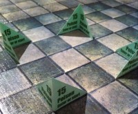 Around mid-Paragon tier, zones in 4e start to become a problem. More and more monster and player powers create zones, some lasting for only a turn, and others lasting for the entire encounter. Just recently I ran an encounter with a monster that could create 5 separate zones that each last until the end of the encounter!
Trying to track each zone can be quite the pain: since they can be temporary and/or mobile, things like dry erase markers don’t work very well. Using something that sits underneath the minis is similarly annoying each time you need to place or remove them. Even if you do manage to get the zone marked, it can be tough for the players to keep track of which zones have which effects. “Does that damaging aura apply when I enter the zone, or only when I start my turn there?” is a question I used to hear quite a bit.
Luckily, I have created an accessory that solves all of these problems. These paper markers are convenient, unobtrusive, and if you take the extra time to prep your encounter with customized markers, your players will never ask you what a zone does again!
Download
The zip file includes a Photoshop file (see instructions below) as well as flat PNGs for those without Photoshop.
Simply print the template on to some heavy cardstock, cut along the lines, and then fold each triangle in half.
Instructions for using the Photoshop template
The photoshop template is wired up with a couple really snazzy features that are intended to make your life easier when creating awesome looking zone markers tailored to your players and monsters.
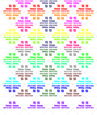
The template contains 15 sets of 4 markers, and is laid out so that you can print the same layout on the front and back of the sheet of paper to get double-sided markers. The image to the right shows how the 15 different sets are laid out.
To make things more convenient, each set of markers is wired so that you only need to modify one of them and all four will automatically update to be the same. This is accomplished by the use of Smart Objects (thanks chmod777!)Â which I will explain how to use.
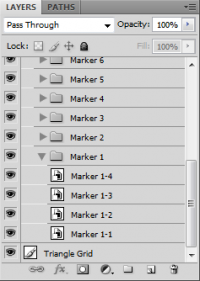 Each marker set is organized in to its own group, which contains the four instances of the Smart Object for that group. To modify the marker, double-click on the icon (not the text) for any of the markers in the group. When you do this, a new image will open in Photoshop as if you have opened a whole new file. This is the Smart Object. All of you have to do is modify it to look how you want, save the document, and when you click back to the main template, you’ll see all four instances of that marker updated automatically.
I have put a couple features in to each smart object in the template to make a few things more convenient:
- There are guides in place to help you line up text so that it’s consistent across all of your markers.
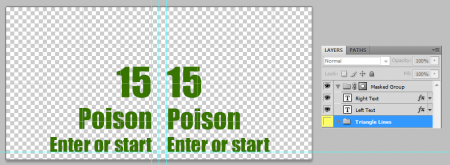
- There is a layer called “Triangle Lines” (hidden by default) with the diagonal lines of the marker which you can toggle on to see the bounds of the marker.
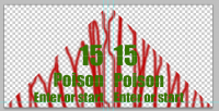 The  group labeled “Masked Group” is already set up with a mask that will prevent anything from spilling out of the bounds of the marker. This makes it easy to put a thematic pattern on the marker without having to cut it in to the shape of the triangle. Be sure to put new layers inside this group!
Feedback
I would love to hear from you if you end up using these in your own games, find a way to improve upon it, come up with awesome designs for your markers, or anything else!
Please email me at podcast@thursdayknights.com with any sort of feedback, or if you’d rather, come post on our forums!
